When orchestrating color in painting is very much like composing music. The artist, like a composer, is trying to convey a certain mood and emotions to their audience. The old master artists used these psychological effects to their advantage, so beautiful music is sound organized in a way that evokes pleasant emotions by means of sounds. On the other hand, the painter in order to create visual interest and construct a musical symphony on his canvas, he must organized singing strokes with chroma pigments and values. Therefore, the artist must understand that the key in a painting is the dominant hue, so the dominant hue influences which colors may be used, at what level of chroma each color used may be presented, so we the artist must know the maximum proportion a color can occupied without disrupting the harmony of the painting. A simple way to set the key of a painting is to toned the canvas with the dominant hue. Note how Sargent toned his canvas and the colors and values used for this master piece:
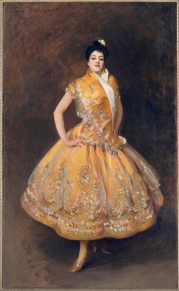
Sargent’s ability to convey life in his portraits is due to his mastery of usage of neutrals in his paintings, thus neutrals in a painting may be thought of as comparable to rest in music and the brightest, highest chroma pigments as the highest, most beautiful notes, which are saved, so the soprano can shine. However, these sophisticated notes would have not been able to be performed if the stage was not properly done. The effectiveness of this painting and exquisite beauty is based on the construction of masterful passages of neutrals and areas of lower chroma, thus to set up the singing strokes of the most brilliant colors, which are brilliantly executed by the artist. In addition, in the interaction of Sargent’s color, we can analyzed that color is affected by what is near, so a color surrounded by darker values it will look lighter. Sargent strategically engineered for the greatest emotional impact to be the sitter’s face, thus without organization of chroma and values this visual concert, it ceases to be a master piece and it becomes an ordinary painting.
the Key establishes which scales will work and which cords, and so on will not. As it relates to painting an artist must understand what dominates his paintings and plan to tone the canvas with a dominant hue, but also select a dominant value. The artist’s goal is to create a visual element that is based on opposition, so each dominant factor is best highlighted. For example, in a painting with a warm dominance, a neutral gray made with white and black will appear to be blue and can be use in its place. But these colors and values should aligned with either the dominant chroma or the dominant value, thus greater unity. An excellent example of this principle is a painting done by William-Adolphe Bouguereau.
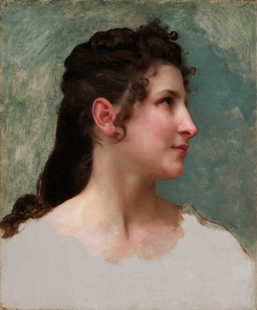
This painting has a special kind of light for creating a mood and as you can observe the artist is an authority in the control of values and chroma. There is much to be learned from the old masters, and is here where they want you to focus your attention to, as they knew that value and chroma are the key elements to a successful painting. In conclusion, the most important aesthetic consideration in a painting is the emotional content, or mood. This is what moves the viewer more deeply than anything else, but a mood expressed without consideration of color and value is like a composer without his orchestra.